
An endless game can’t lean on a “next level” screen to make the world feel new.
Tower Blast! needed a different kind of movement — the sense that the run itself is travelling somewhere. That became the theme system: a set of visual worlds that melt into one another while the same tower stays in your hands.
The themes were the fun part. The transitions were the work.
One silhouette, many moods
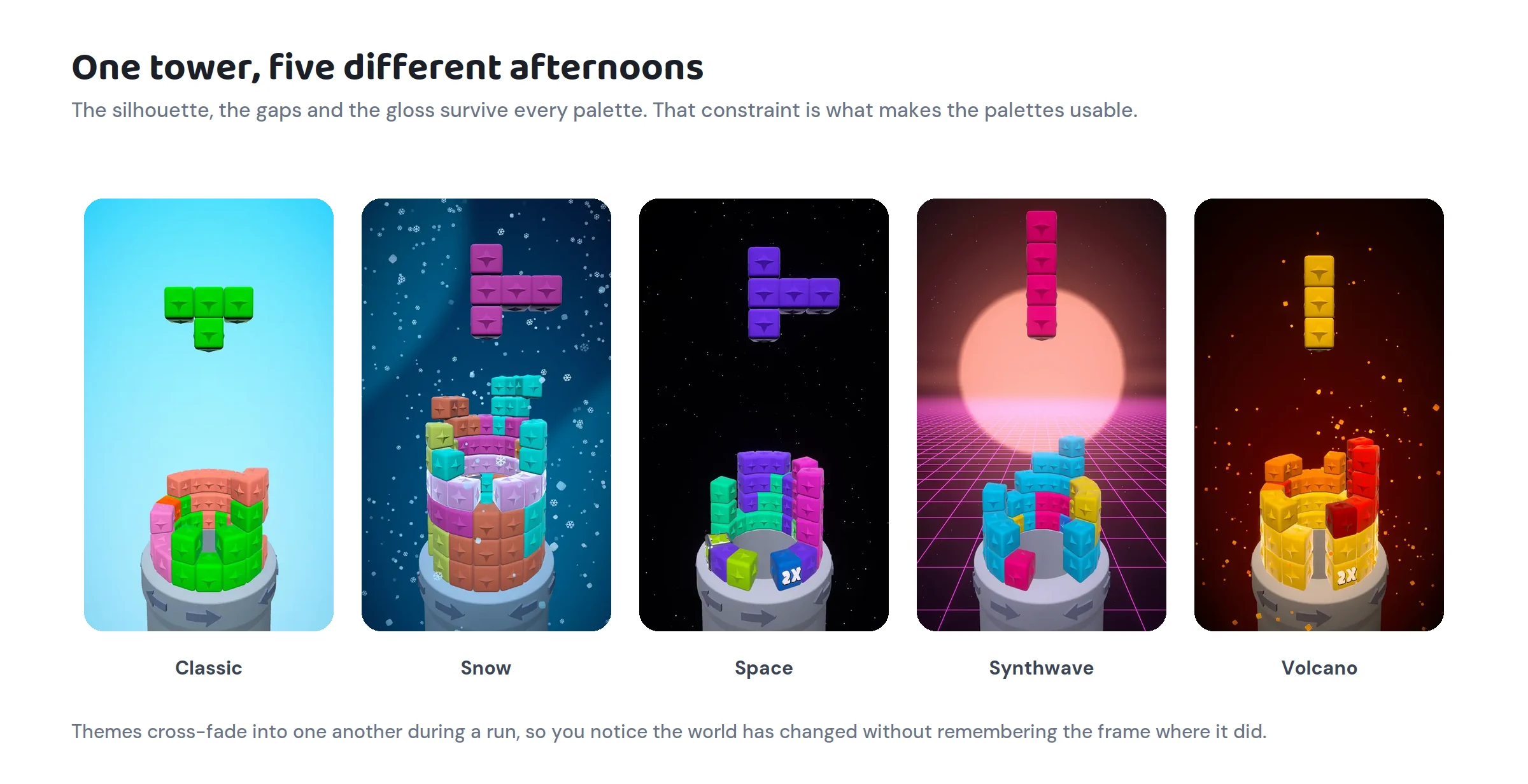
The tower is always the anchor. Its radial shape, its glossy faces and its readable gaps have to survive every palette we throw at them.
That constraint is a gift. Instead of redesigning the game for each theme, the question becomes narrower and more interesting: what can light, colour, atmosphere and surface do to reinterpret the exact same object?
Snow is crisp and cool. Space drops the ambient light so every glossy face carries more contrast. Volcano brings heat up from underneath. Dunes goes light enough that the whole value structure inverts. The mechanics don’t move. Your reading of them does.
Colour has a job
We love candy colour, but “more colour” is not an art direction. Every theme starts from the same four-part relationship:
→ a sky gradient that sets the atmosphere → a dark value that keeps the tower readable against it → one energetic accent reserved for feedback → a block palette that still separates two pieces sitting next to each other
The accent isn’t allowed to fight the game state. A warning has to keep reading as a warning. A blast has to stay the brightest thing on screen. If the background spends the whole visual budget, the interaction loses its voice — so even the loud themes have quiet regions. The eye needs somewhere to rest before the next ring goes.
Lighting is the mood dial
The scene used to have five lights. They came from every direction and cancelled each other out, and the tower read as a flat sticker sheet rather than a cylinder.
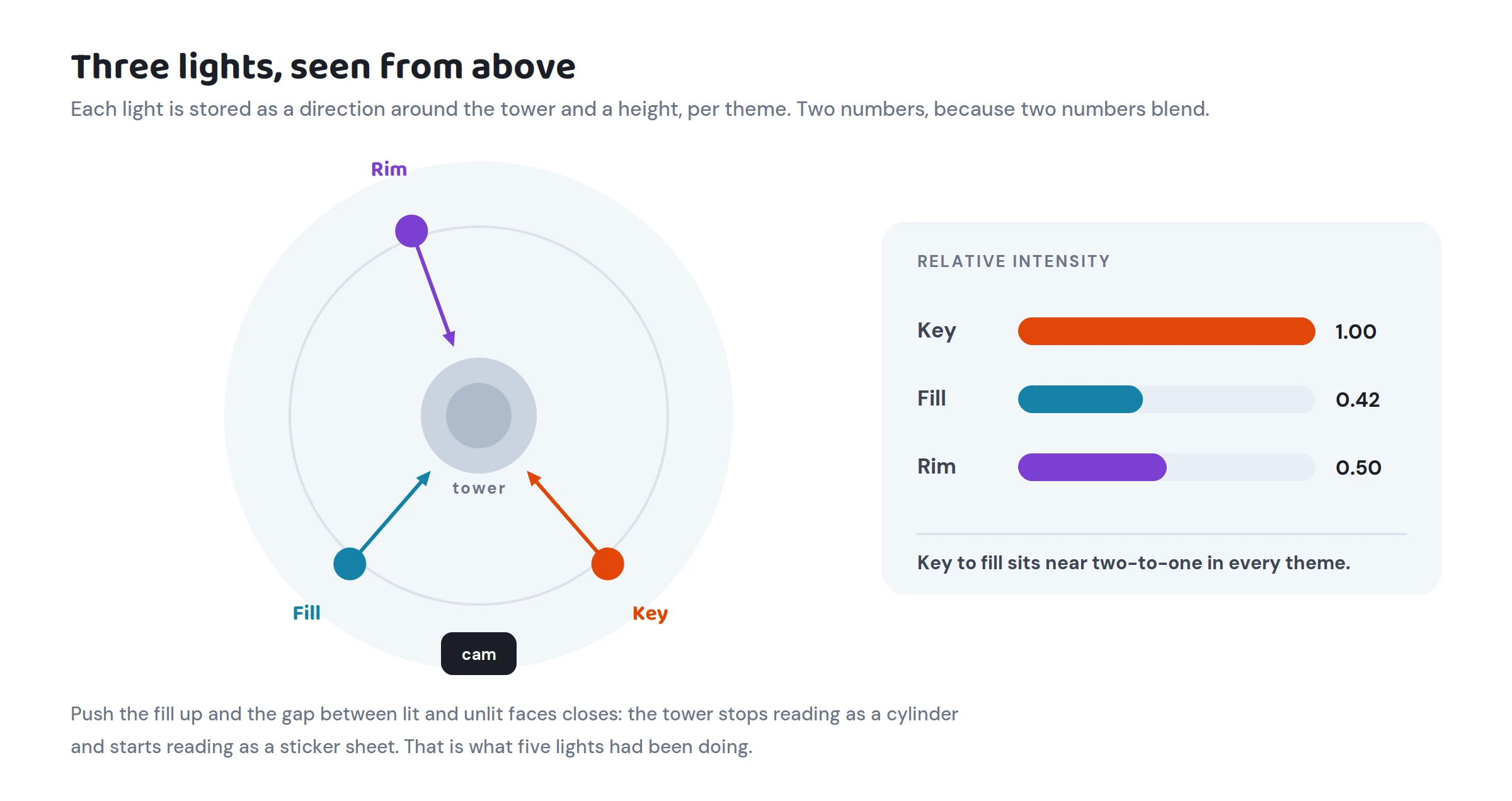
It’s three now: a key, a fill and a rim, each stored as a direction and an intensity, per theme.
The ratio between key and fill is the dial. Push the fill up and the shadow side collapses — the gap between lit and unlit faces closes and the tower stops being round. Pull it down and you get drama the game doesn’t want. Every theme in the game is authored inside a narrow band around two-to-one, which is where casual lives.
The rim gets judged differently. A rim is about edges, not about the average, and if a rim moves the overall brightness of the frame much it has stopped being a rim.
The light that takes the short way round
Storing directions as angles instead of rotations turned out to matter more than expected.
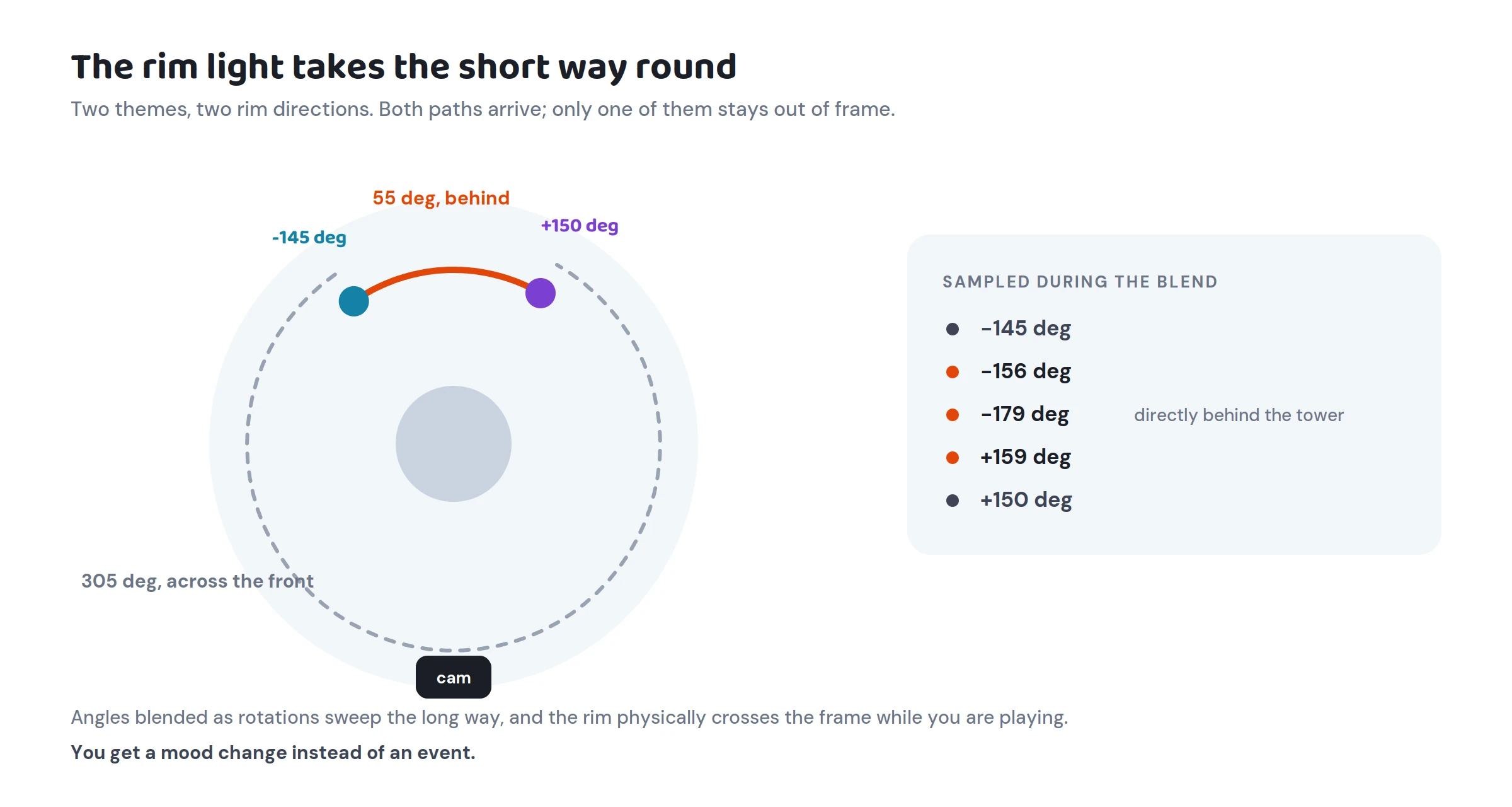
One theme’s rim sits at −145°. The next theme’s sits at +150°. Blended the naive way that’s a 305° sweep — the rim light physically crosses the front of the tower while you’re playing, which looks like a mistake because it is one.
Blended as angles, it takes the 55° path behind the tower instead. The value goes −145, −156, −179, +159, +150 and the light never enters the frame. You get a mood change and no event.
Transitions are compositions
Blending two colour values is easy. Blending two moods is not.
Everything that can be interpolated — sky gradient, ambient light, post-processing, block palette, even the tint on the HUD buttons — lerps over about a second, eased. Everything that can’t be interpolated — a block material, a block mesh, a particle prefab — swaps at the midpoint, hidden inside a scale pulse on the blocks so the jump reads as a deliberate morph rather than a pop.
Two details make it survive contact with a real run:
A transition can be interrupted. All clears can arrive faster than the blend finishes. When a new theme starts mid-blend, we re-base onto a snapshot of where the screen currently is, not onto the last theme’s authored values — otherwise the picture snaps backwards before it starts moving forwards.
Nothing is allowed to write to an authored asset. Everything the system touches at runtime is a copy: a duplicated sky material, a second post-processing layer, per-renderer colour overrides. Tint the real asset instead and you permanently overwrite hand-tuned values on disk, with no undo, the moment you leave play mode. We check the originals come back byte-for-byte after a full session.
Backgrounds want more room than you think
The sky is one shader with optional layers — stars, waves, aurora, grid, sun, veins, nebula — which is what lets two completely different backgrounds cross-fade as a plain colour blend rather than a cut between two different materials.
The layers needed reining in. The ridged noise we use for veins peaks wherever the underlying noise sits near the middle of its range, and near the middle is most of the field. The first build of one theme flooded the entire sky into a mid-value cyan that collided with the block palette and made the tower hard to read at a glance.
The lesson generalised: assume a background layer will cover more sky than you expect, then cut it back until it’s a feature again.
Gloss without plastic noise
The blocks are meant to look touchable — candy, glass, polished game pieces, without settling into one material.
Their specular is at zero. The look comes from a broad edge sheen and a very high smoothness value, which produces a pinpoint highlight a flat face never quite catches — so the shape stays readable on a phone and the animation gets to do more of the character work.
Two themes swap the block for a flat-faced mesh, and their surface patterns had to scale down by about two and a half times to work on it. At the original scale there were too few pattern cells per face, and melon started reading as dice.
The recognizable frame
The goal was never for every screenshot to share a palette. It’s for every screenshot to obviously belong to the same game.
The radial silhouette, the soft vertical sky, the candy gloss, the restrained particles and the weighted motion do that job. A theme can be frozen or molten, nearly monochrome or completely saturated, and still be recognisable at thumbnail size.
Many skies, one tower.